I looked on the font website Dafont to get some ideas and here are 3 that are shortlisted for our film title sequence.
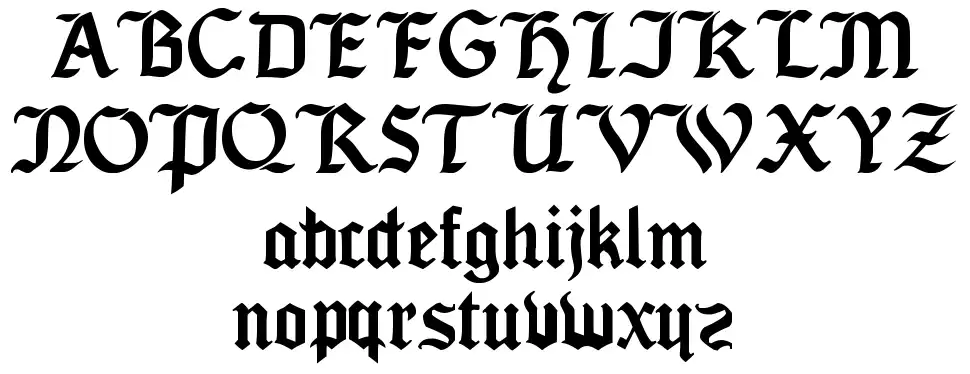
Deutsch Gothic. http://www.dafont.com/deutsch-gothic.font

Seagram TFB.http://www.dafont.com/seagram-tfb.font
Augusta.http://www.dafont.com/augusta.font
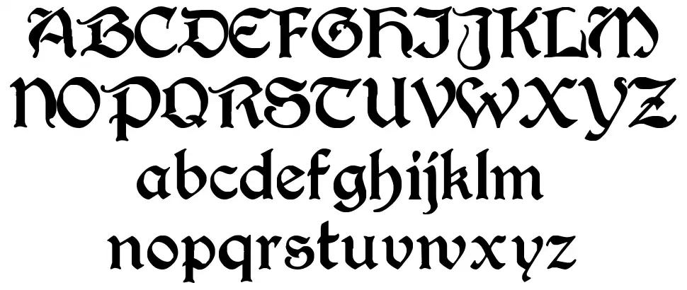
All of these fonts would be effective as they are clear and easy to read. They are all designed in a classic gothic style. They all fit with the story and the plot of the story as it has a big focus on classic literature. They are all also quite bold and eye catching which would help in making them memorable for the audience.
For my movie I would chose the Seagram TFB font as in my opinion it is the easiest to read whilst still being bold and eye catching.
No comments:
Post a Comment